


Dialogues I – 15 years zs art


Walter Angerer-Niketa
Jean-Paul Dumas-Grillet
Ingeborg G. Pluhar
Roland Goeschl
CX Huth
Duks Koschitz
Karl Kriebel
Ray Malone
Martin Noël
Drago Prelog
Veronika Rodenberg
Robert Staudinger
Emil Toman
Jesse Willems
Irene Wölfl
Guido Zehetbauer-Salzer
opening:
11/04/2024, 7 pm - 9 pm
7.30 pm: In the course of the opening, the zs art gallery pays tribute to its artist Ingeborg G. Pluhar on the occasion of her 80th birthday this year, which she celebrated on 8th of March 2024. Andrea Zehetbauer and Guido Zehetbauer-Salzer read excerpts from Ingeborg G. Pluhar's letters to Kunstl (a personified art figure who stands for the values of art). In this letters, she describes her struggles in the creative process and her demarcation from craft or even kitsch. It symbolises the subliminal, permanent confrontation with art.
exhibition: 12/04/2024 - 05/06/2024
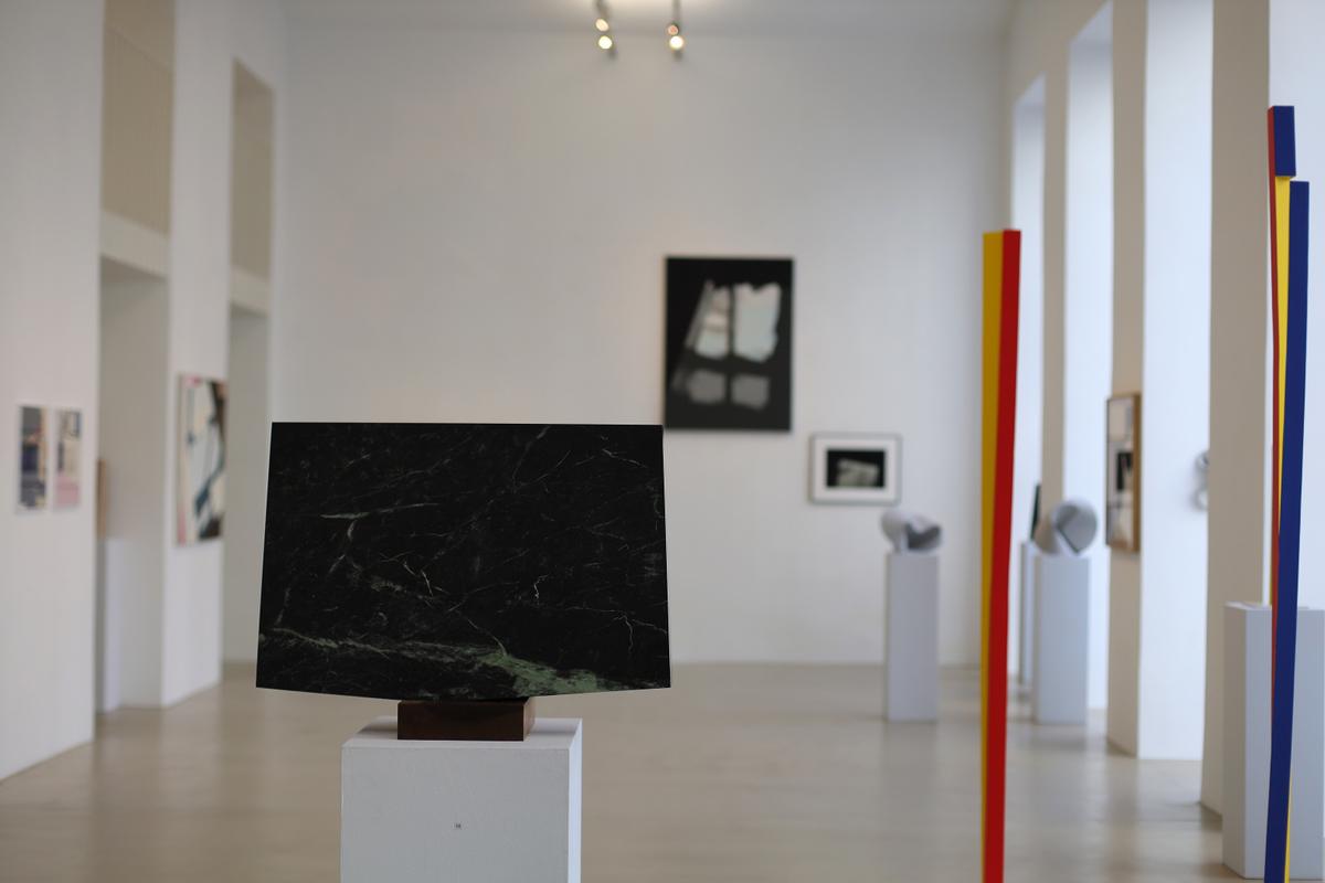
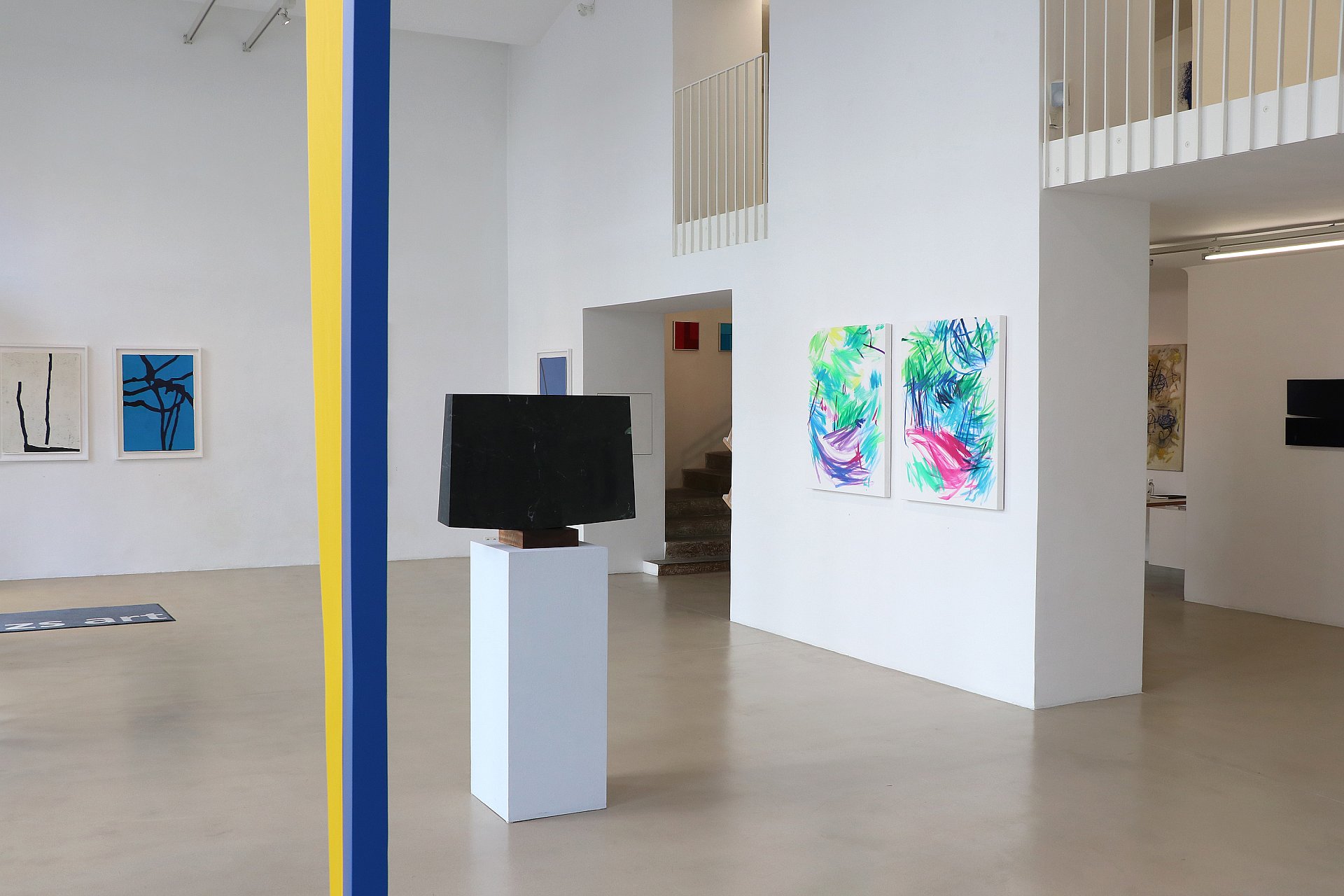
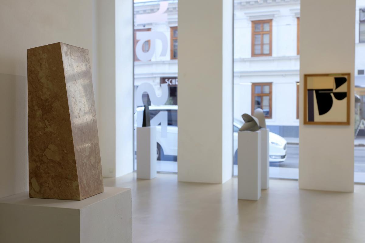
We are celebrating 15 years of zs art gallery in II exhibition phases.
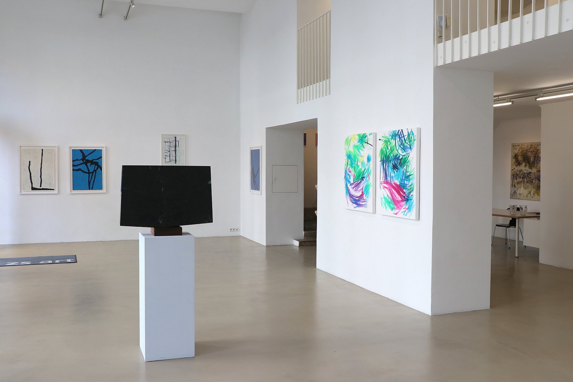
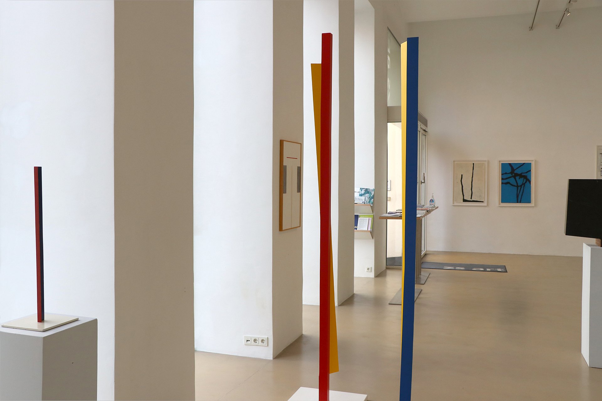
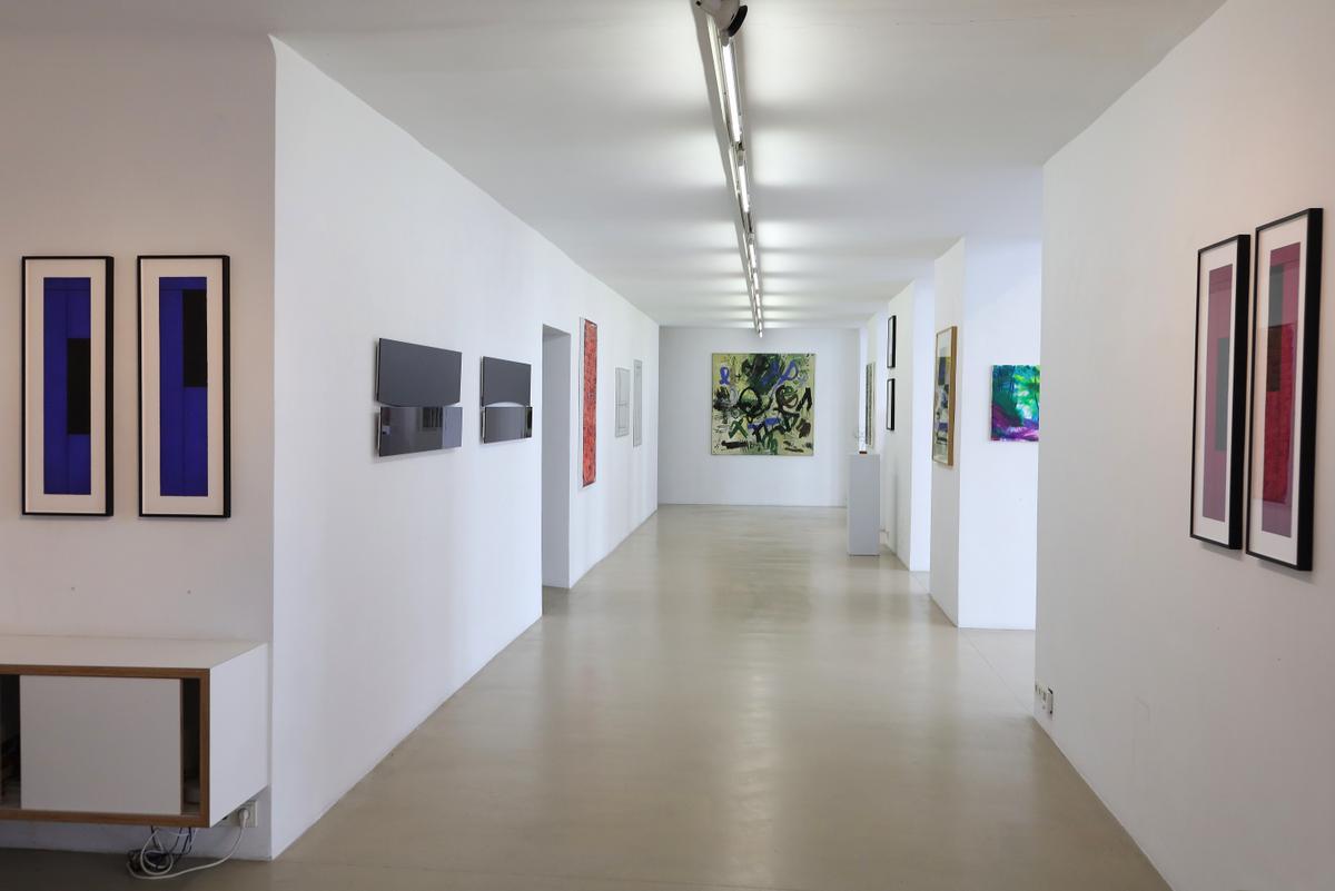
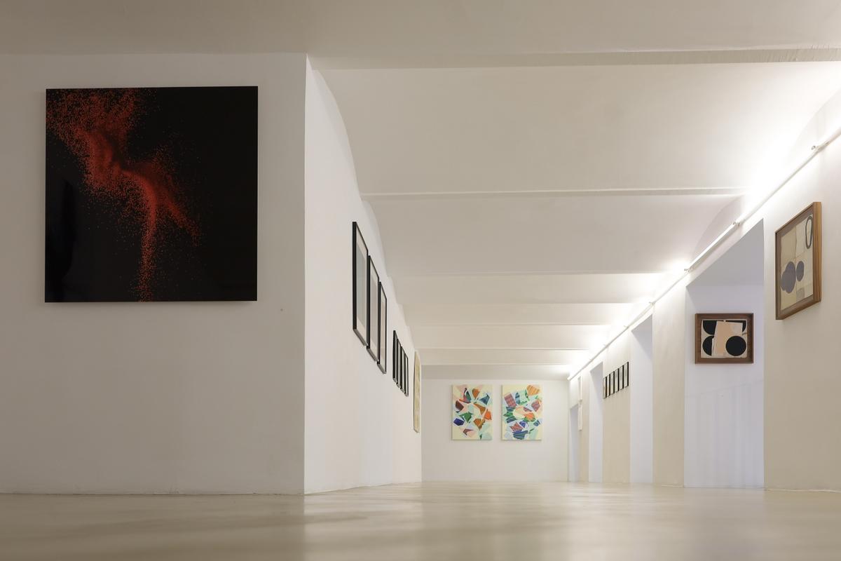
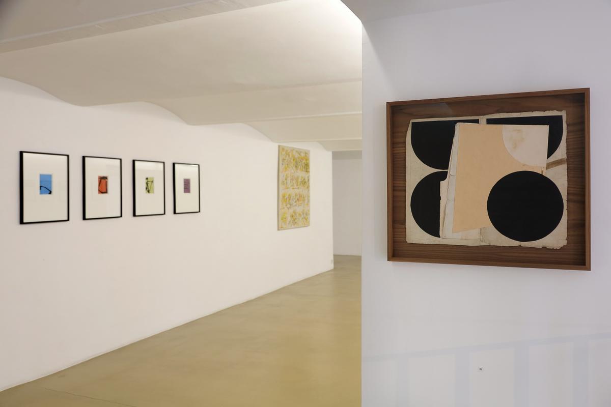
It is a compilation of selected works by current zs art artists and guest artists from recent years. Controversial and at the same time varied, they are staged in relation to each other.
Walter Angerer-Niketa (1940-2021) leaves behind an impressive portfolio that beautifully illustrates his transformation from a student of Wotruba and Pillhofer to an independent, uncompromising minimalism. His statement on eternity, which he also manifested impressively in his gouaches, wooden sculptures and folds, was to visually set the static, cubically cut stone in motion.
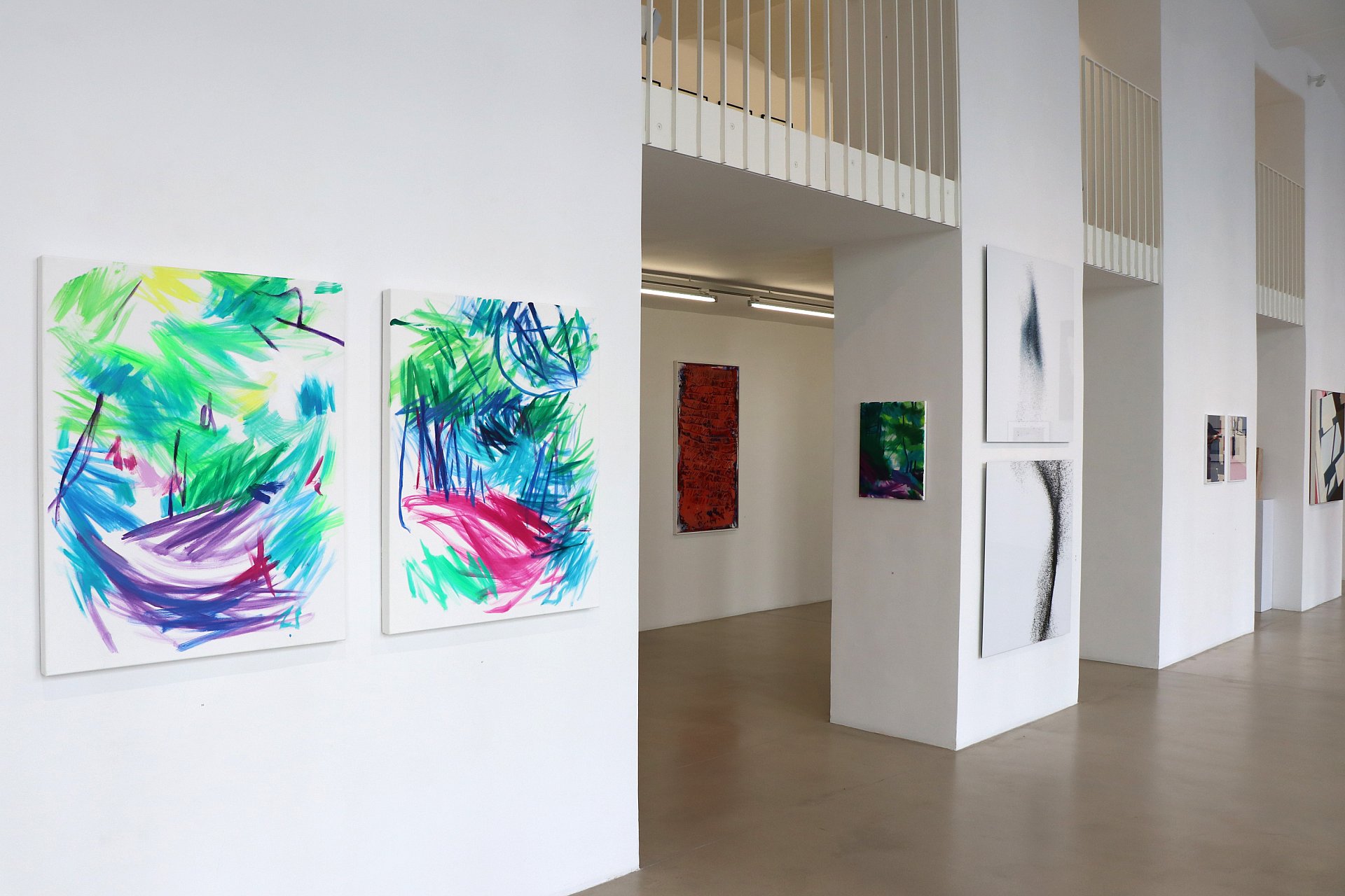
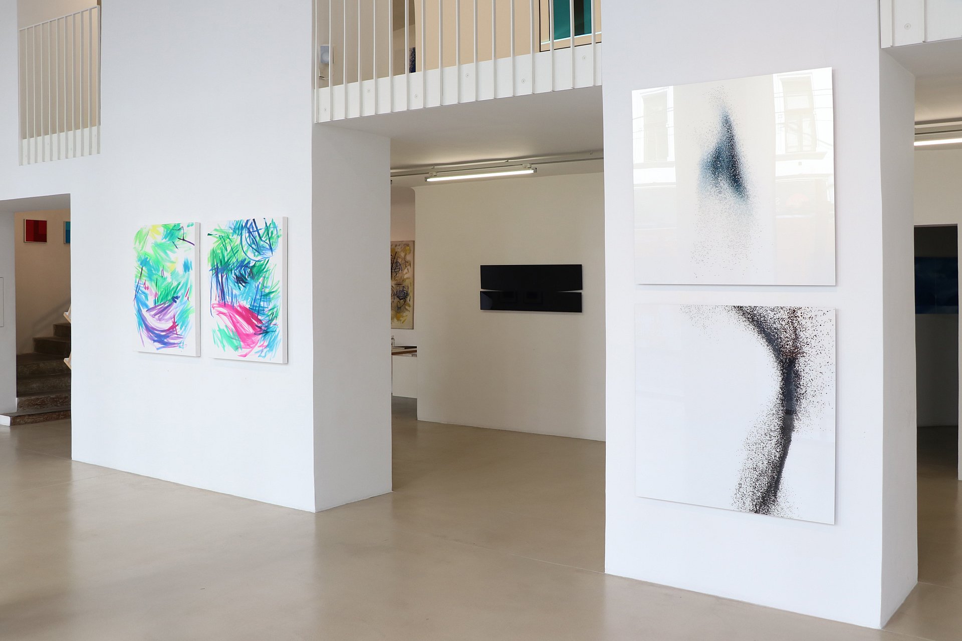
Guido Zehetbauer-Salzer dedicates his paintings and drawings to the forest / trees: the living creatures that populated the planet millions of years before us and will survive mankind despite all overexploitation. He narrates this natural space as we will remember it when we have reduced its existence to a few refuges: tasting only the scent, incredibly lyrical and sensually abstracted.
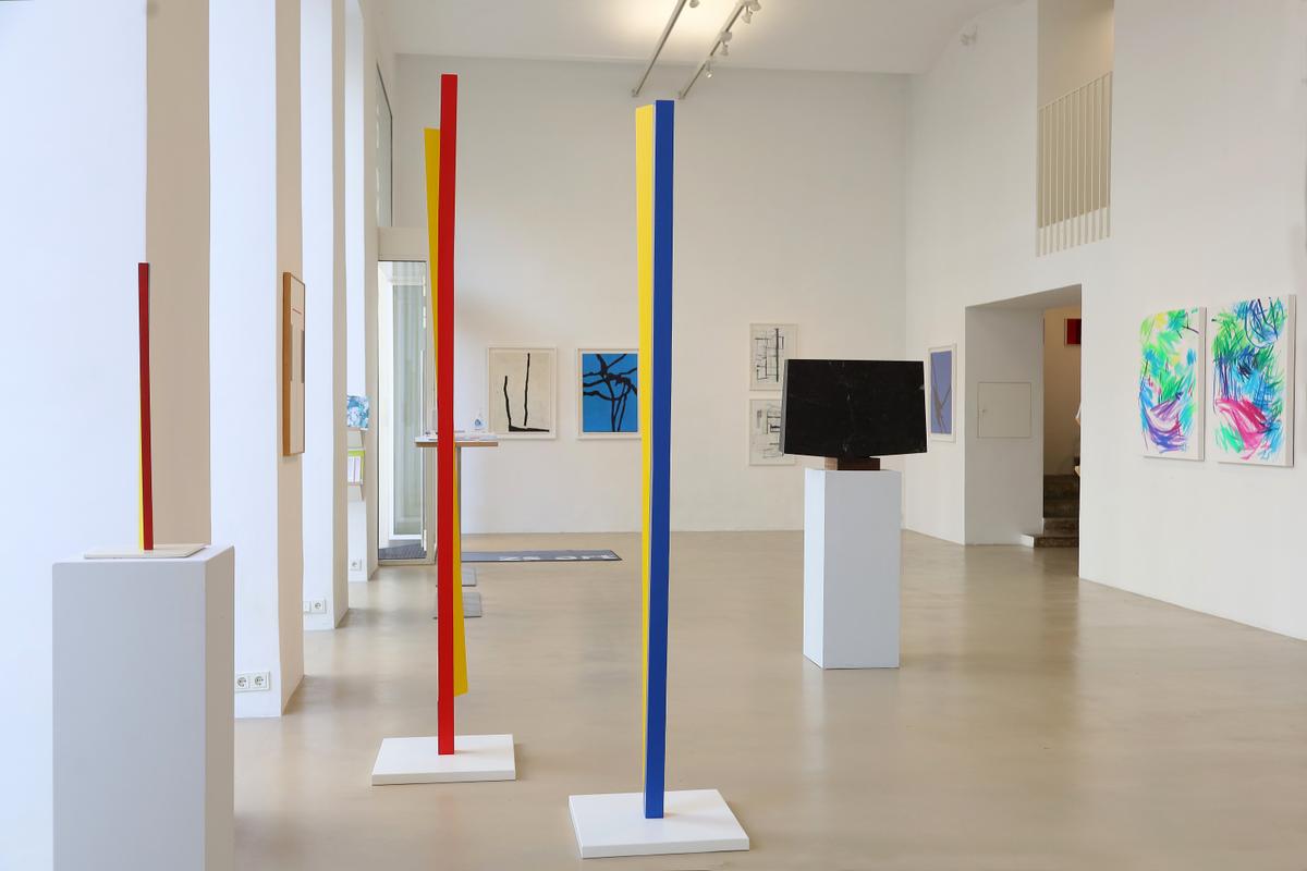
In contrast, Roland Goeschl (1932-2016) used the wood of the tree trunks for his steles, dead ends and corner shifts to allow the colour (red, yellow, blue) to become the material. The colours lend the cubic constellations of shapes drama, dynamism and rhythm.
Jesse Willems alternates between geometric shapes and materials in elegant wooden display cases with contemporary art made from old paper. In doing so, he transcends transience with timelessness and thus appears familiar today.
Duks Koschitz forms unpredictable folded constructions out of paper, actually cardboard. He uses an earlier method of making cardboard particularly hard-wearing. You may remember the brown cardboard suitcases from the 1950s. With grey or white cardboard treated in this way, Ducks Koschitz conjures up swinging landscape architecture.
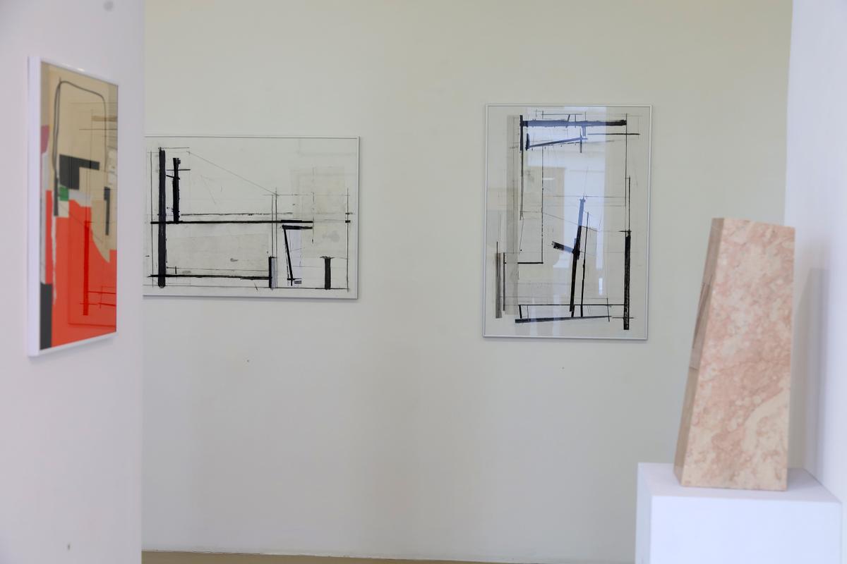
Karl Kriebel deconstructs glassy, non-objective architecture with different line thicknesses and grey tones. The ground plan and elevation alternate constantly, making it impossible to grasp or comprehend the architecture. What remains is an immersion in an unfathomable world of its own, far removed from nature.
Martin Noël (1956-2010) had his "organic constructivism" honoured in 2019 with a solo exhibition at the Albertina and at the same time at the zs art gallery. Cracks in the asphalt or the shadows of vegetation on façades are his sources of inspiration. Lines or surfaces that he creates with radical minimalism in wood and linocut. The imprint of colour lends the paper or canvas a painterly style.
Ingeborg G. Pluhar paints reflections broken down into two-dimensional contour fields. Subtitle: "Emerged-Discovered-Discovered". Ingeborg G. Pluhar devotes her attention to the incidentals, bringing the background, the accessories onto the stage.
The "Blue Objects" by Veronika Rodenberg - two-part rectangles, one part matt, the other shiny - seem to float in the room, at a slight distance from the wall. The exciting thing is the shape of the division, its pointed geometry is pure aesthetics by virtue of radical reduction.
Ray Malone is also a master of poetic minimalism with his rotations, for example. A composition of the square, which experiences maximum tension and rhythm through minimal, linear and two-dimensional division. He breathes a subtle curvature into the divided areas of colour with charcoal. The imperceptible three-dimensionality pleasantly irritates the geometric order.
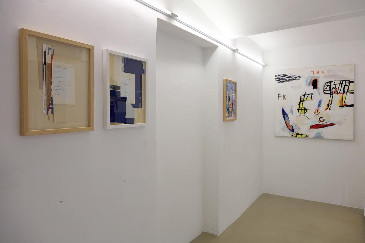
Irene Wölfl's sewn collages are no less rich in discovery. She reads stories in found, discarded and used objects. Their traces of use tell of fates and Irene Wölfl turns them into her own, different narrative. Gems to sink into a lost time.
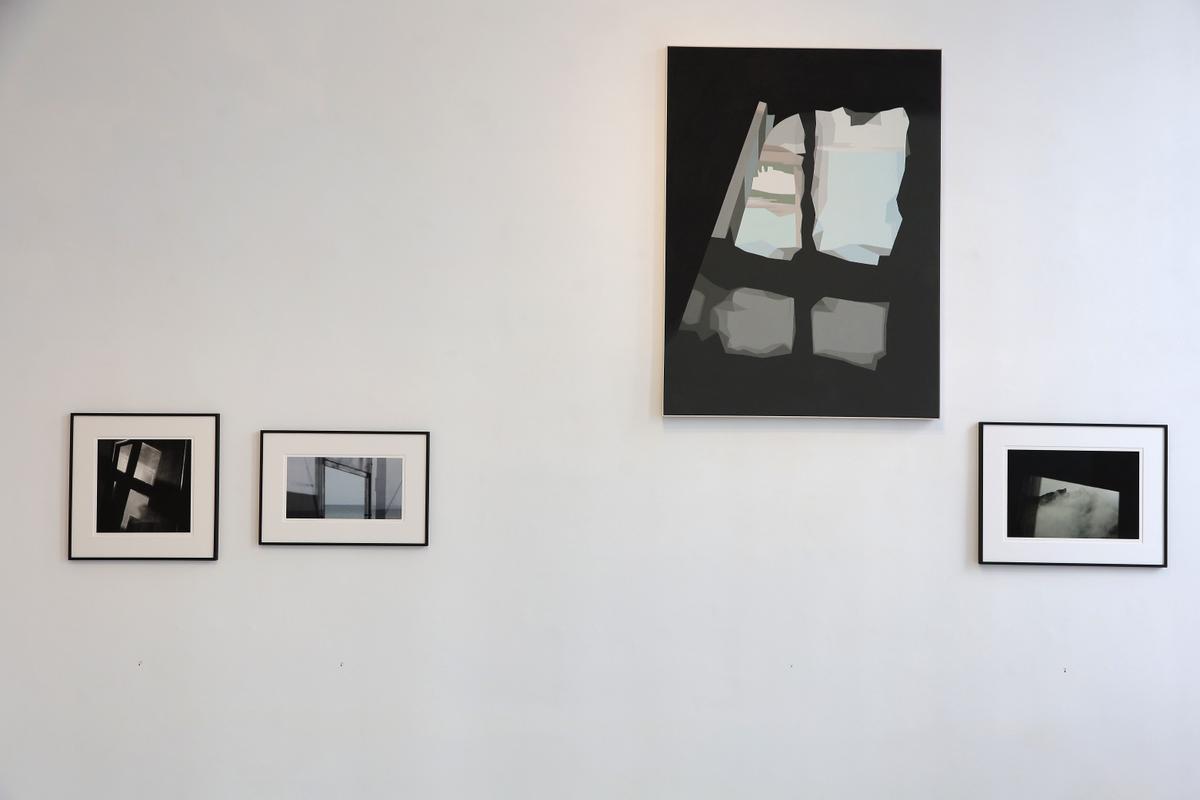
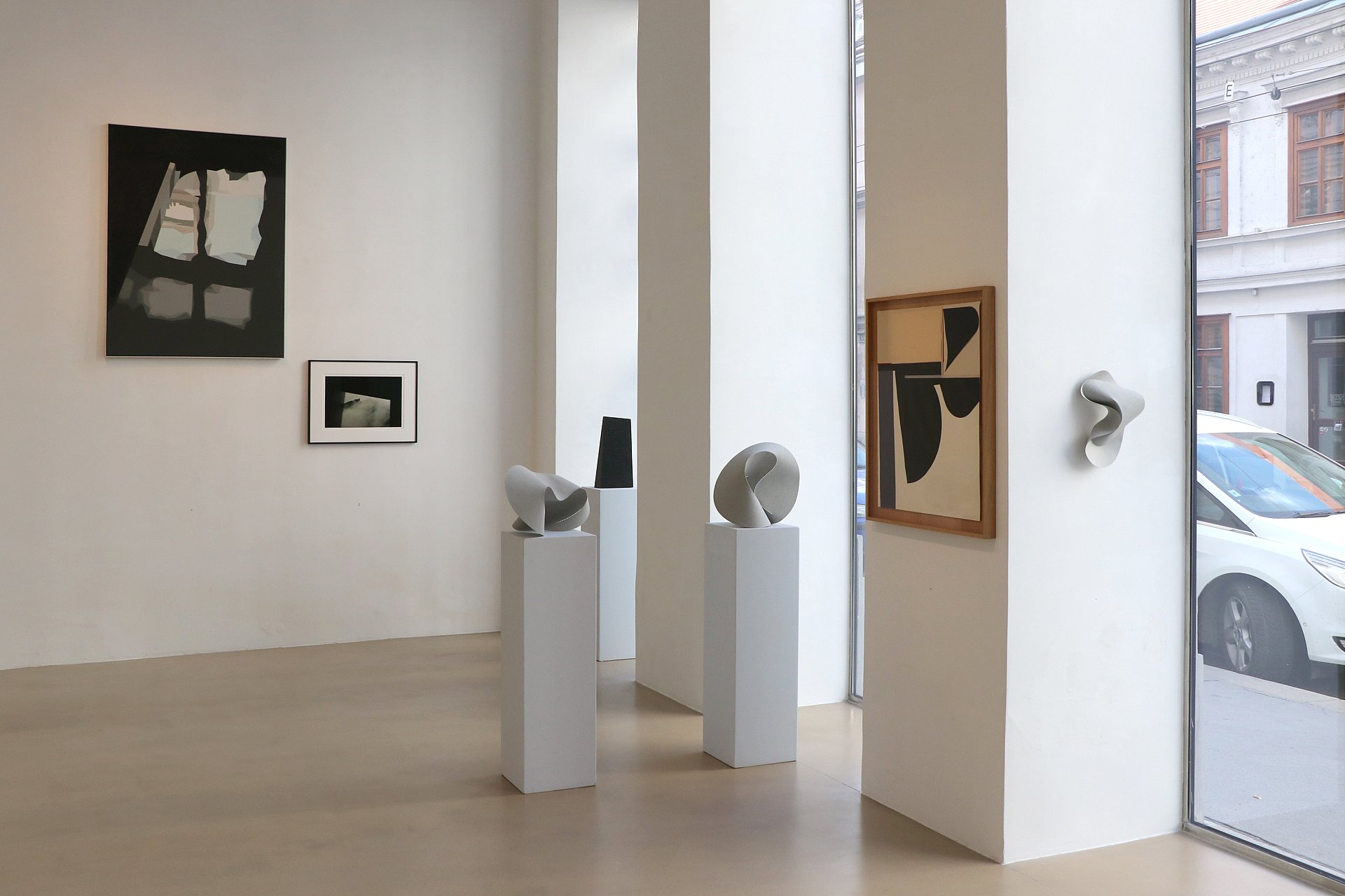
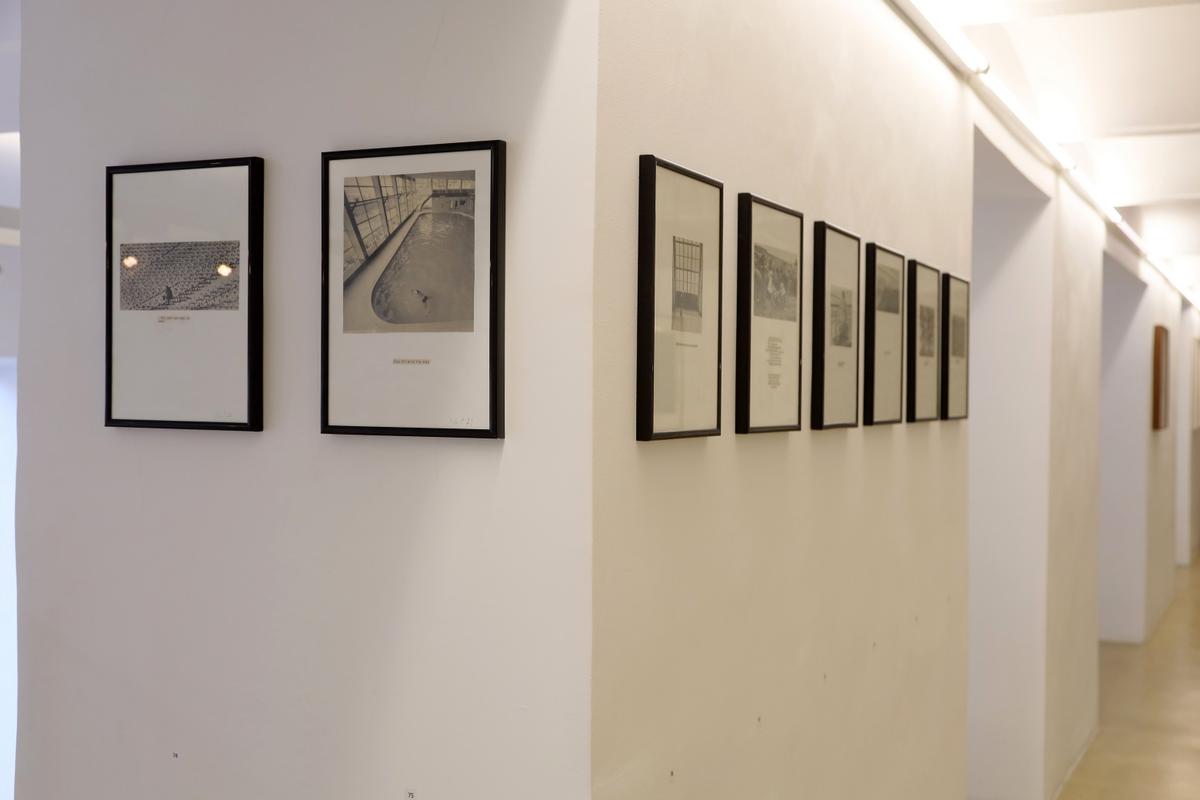
The French cameraman Jean-Paul Dumas-Grillet uses his camera to take photos of banal everyday scenes. For example, looking out of the window at the window opposite. Or the mirror reflecting the window of the room and another one outside. The landscape framed by the window of a moving train. One is inclined to suspect romantic, mysterious events behind the windows. Lasting moments of exposure from timelessness.
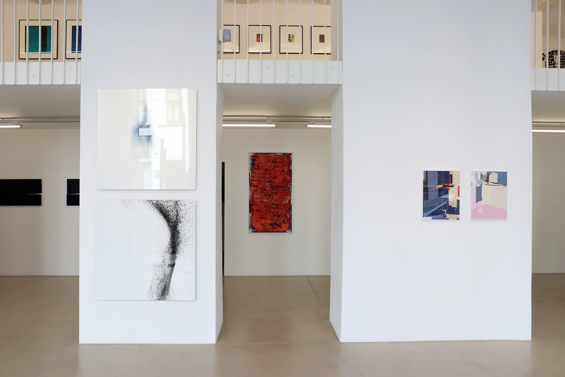
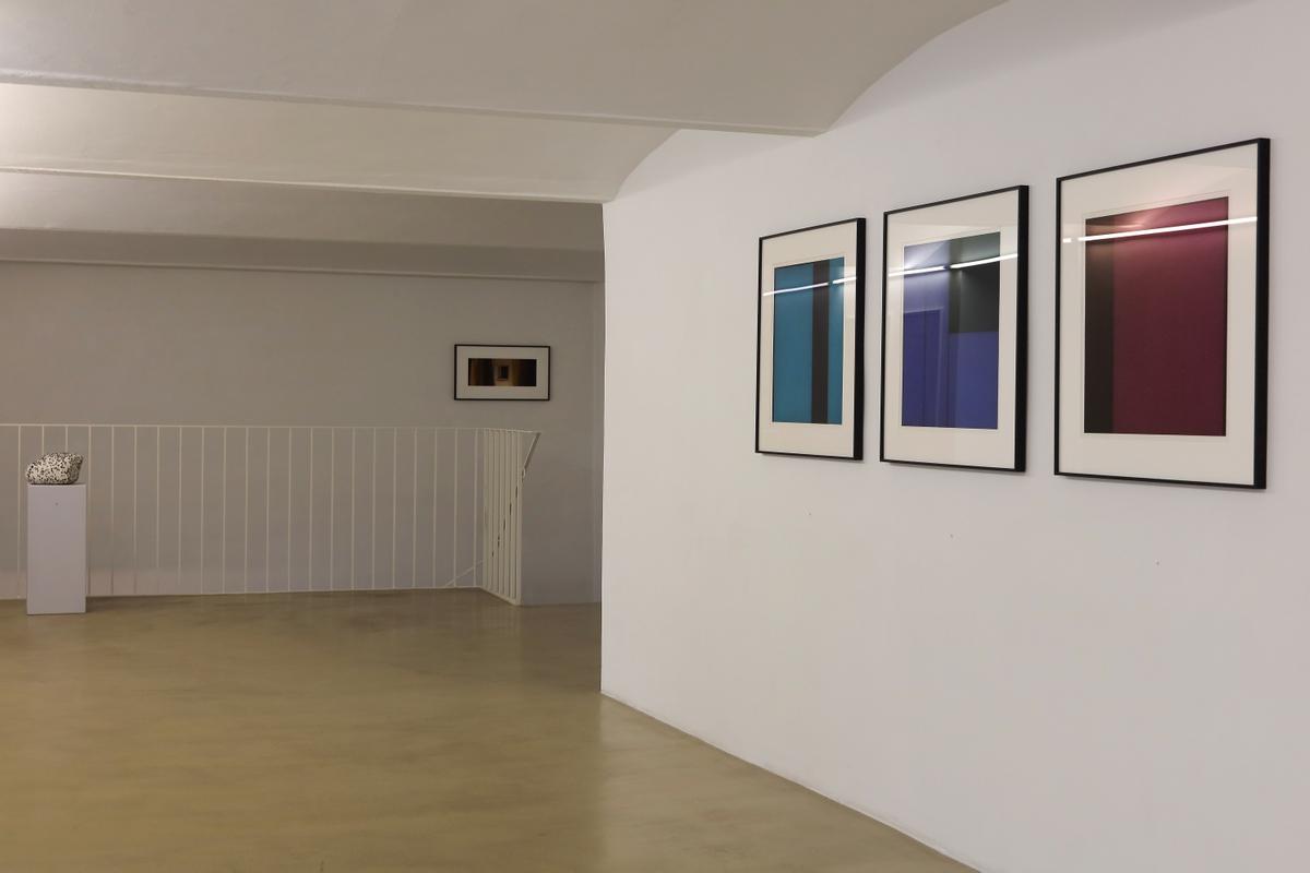
Robert Staudinger's photographic concepts are masterpieces of photographic art. With the "Unstable Bodies" series, he created contemporary bulk images. Millions of lenses thrown together in front of a pool of light, he captures the decisive moment when, for example, masses of lenses collide. Amorphous forms "painted" by chance into the empty space.
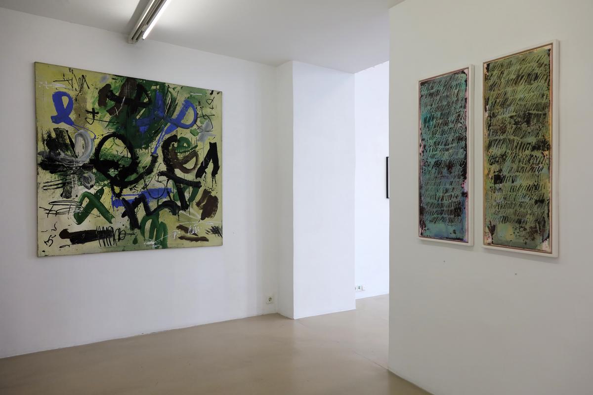
Emil Toman (1923-2007), the nature lover, painter and teacher, was a seeker. He found his way of expression in Art Informel. In most of his later pictures, he painted his greatest wish: to be in touch with the universe.
CX Huth invents characters and situations and tells quirky comic stories about friendship in pictures and painted texts. They are a firework display of exuberant fantasy from another world.
Drago Prelog answered the question as to when he started drawing his lettering: "Since I was 4 years old. He was so impressed by the writing of adults that from then on he imitated their writing, which he could not read. Later, as a mature painter, he cultivated his passion and was demanded by the students of the art academy as their professor by strike. And rightly so, because in Drago Prelog's typefaces, every single stroke of his universal type structure is fascinating.
It is a compilation of selected works by current zs art artists and guest artists from recent years. Controversial and at the same time varied, they are staged in relation to each other.
Walter Angerer-Niketa (1940-2021) leaves behind an impressive portfolio that beautifully illustrates his transformation from a student of Wotruba and Pillhofer to an independent, uncompromising minimalism. His statement on eternity, which he also manifested impressively in his gouaches, wooden sculptures and folds, was to visually set the static, cubically cut stone in motion.
Guido Zehetbauer-Salzer dedicates his paintings and drawings to the forest / trees: the living creatures that populated the planet millions of years before us and will survive mankind despite all overexploitation. He narrates this natural space as we will remember it when we have reduced its existence to a few refuges: tasting only the scent, incredibly lyrical and sensually abstracted.
In contrast, Roland Goeschl (1932-2016) used the wood of the tree trunks for his steles, dead ends and corner shifts to allow the colour (red, yellow, blue) to become the material. The colours lend the cubic constellations of shapes drama, dynamism and rhythm.
Jesse Willems alternates between geometric shapes and materials in elegant wooden display cases with contemporary art made from old paper. In doing so, he transcends transience with timelessness and thus appears familiar today.
Duks Koschitz forms unpredictable folded constructions out of paper, actually cardboard. He uses an earlier method of making cardboard particularly hard-wearing. You may remember the brown cardboard suitcases from the 1950s. With grey or white cardboard treated in this way, Ducks Koschitz conjures up swinging landscape architecture.
Karl Kriebel deconstructs glassy, non-objective architecture with different line thicknesses and grey tones. The ground plan and elevation alternate constantly, making it impossible to grasp or comprehend the architecture. What remains is an immersion in an unfathomable world of its own, far removed from nature.
Martin Noël (1956-2010) had his "organic constructivism" honoured in 2019 with a solo exhibition at the Albertina and at the same time at the zs art gallery. Cracks in the asphalt or the shadows of vegetation on façades are his sources of inspiration. Lines or surfaces that he creates with radical minimalism in wood and linocut. The imprint of colour lends the paper or canvas a painterly style.
Ingeborg G. Pluhar paints reflections broken down into two-dimensional contour fields. Subtitle: "Emerged-Discovered-Discovered". Ingeborg G. Pluhar devotes her attention to the incidentals, bringing the background, the accessories onto the stage.
The "Blue Objects" by Veronika Rodenberg - two-part rectangles, one part matt, the other shiny - seem to float in the room, at a slight distance from the wall. The exciting thing is the shape of the division, its pointed geometry is pure aesthetics by virtue of radical reduction.
Ray Malone is also a master of poetic minimalism with his rotations, for example. A composition of the square, which experiences maximum tension and rhythm through minimal, linear and two-dimensional division. He breathes a subtle curvature into the divided areas of colour with charcoal. The imperceptible three-dimensionality pleasantly irritates the geometric order.
Irene Wölfl's sewn collages are no less rich in discovery. She reads stories in found, discarded and used objects. Their traces of use tell of fates and Irene Wölfl turns them into her own, different narrative. Gems to sink into a lost time.
The French cameraman Jean-Paul Dumas-Grillet uses his camera to take photos of banal everyday scenes. For example, looking out of the window at the window opposite. Or the mirror reflecting the window of the room and another one outside. The landscape framed by the window of a moving train. One is inclined to suspect romantic, mysterious events behind the windows. Lasting moments of exposure from timelessness.
Robert Staudinger's photographic concepts are masterpieces of photographic art. With the "Unstable Bodies" series, he created contemporary bulk images. Millions of lenses thrown together in front of a pool of light, he captures the decisive moment when, for example, masses of lenses collide. Amorphous forms "painted" by chance into the empty space.
Emil Toman (1923-2007), the nature lover, painter and teacher, was a seeker. He found his way of expression in Art Informel. In most of his later pictures, he painted his greatest wish: to be in touch with the universe.
CX Huth invents characters and situations and tells quirky comic stories about friendship in pictures and painted texts. They are a firework display of exuberant fantasy from another world.
Drago Prelog answered the question as to when he started drawing his lettering: "Since I was 4 years old. He was so impressed by the writing of adults that from then on he imitated their writing, which he could not read. Later, as a mature painter, he cultivated his passion and was demanded by the students of the art academy as their professor by strike. And rightly so, because in Drago Prelog's typefaces, every single stroke of his universal type structure is fascinating.